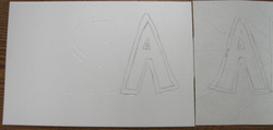
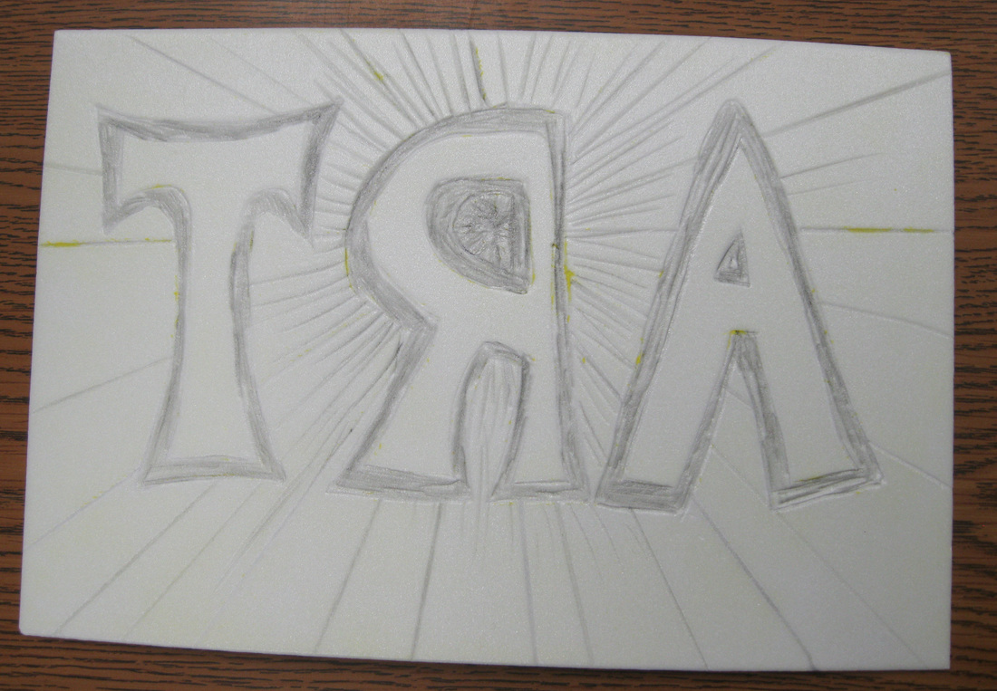
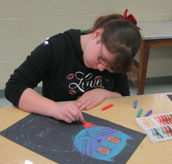
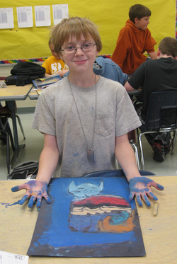
Printmaking is another art process in which some students have had very little experience. It is a fun process that uses different tools, techniques, and materials. The essentials of a print are a design, plate, tools, ink, and paper. The 6th grade students used a thin sheet of styrofoam for their printing plate. The plate is the surface on which the student will indent or press their design. The student will first draw their design on paper and then transfer it to the plate. As you can see, the design is transferred in reverse or opposite of the original draw design. The printing process will reverse your design, so you must place the design in reverse on the plate, so it will print correctly. The styrofoam is soft enough that a simple pencil or pen is used to indent the design. The next step is to ink the plate by rolling an inked brayer over the plate. This is one of those times I reference the Goldilocks story of getting just the right amount of ink on the brayer. Too much will fill in the indentions and too little will not show the design. Once the plate is inked, a piece of paper is placed on top. The student will use one hand to hold the paper on the plate, while the other hand presses the ink onto the paper. The final step is to pull the paper off the plate. The next few images show some of the steps I just mentioned, along with Emily holding up one of her prints. 
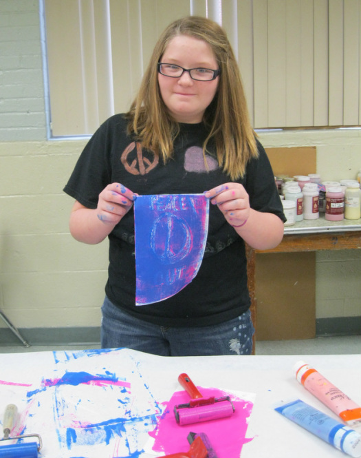
Emily is showing you her print she just printed. If you notice, Emily has two colors on her print. She first printed with the pink ink. Emily then washed and dried her plate before adding more indented designs to the plate. She followed up with using blue ink and pressing it onto the pink print. This is known as reduction printmaking. By the way, at the bottom of this picture, you will see some of the printmaker’s tools…the tubes of ink, and the brayers which roll the ink onto the plate.
0 Comments
Pastels! I wanted my 6th grade students to have this wonderful experience and boy did they ever. Many students never had the opportunity to use pastels before and most of them enjoyed the ability to layer different colors on top of each other to blend them into a new color. By the way, I just adore Emiley's colorful cat with its cool head and warm body! Doesn't it really make for great contrast?! Pastels! For me, it's a love/hate relationship. I just love pastels for their color and ability to blend. Hate is such a strong word, but I "dislike" pastels for...I bet you were thinking messiness? Oh yeah, they are messy, just check out Montana's picture below......but I dislike a pastels need for having to be fixed. If I don't spray them with a fixative, the beautiful, blended colors will go right down the hallway on the person who was just a bit too close to the bulletin board display. From my experience, all good fixatives lay down a barrier over the pastels which does put the chalk in its place, but it also dulls the color or causes it to somewhat disappear....now that I REALLY dislike. I tried a new workable fixative this year that did not change the color much at all, but it sure didn't do a great of keeping the chalk from smearing. :( Here's the picture of Montana I made mention of earlier. You can certainly see how much Montana was into his work...or should I say how much of the work was on Montana! :) At any rate, his smile tells me that pastels are a good thing.
Below, you should find more images of the students at work on their abstract animal pastel work. If you want to see all of the work, it can be found at the address at the bottom of this paragraph. With a little luck, you might be able to click on the address and it will take you there. If not, please copy and paste in your web browser...or click on the Artsonia tab at the top of this webpage. Enjoy! http://www.artsonia.com/museum/gallery.asp?exhibit=588896 |